Examining your features
Now that you understand your features, it’s time to really understand them by examining how they correlate with other features.
The most useful thing you can do is to visualise your features. This may give you better insights that you might have missed when looking at just the numbers.
Luckily, you are now experts at using matplotlib and pandas. So we will just make use of those tools!
Plotting a scatter plot for two features
Let us first try to examine whether the features are actually any good for classifying the flowers. Let’s try to plot a scatter plot for the first two features (sepal length vs sepal width).
import matplotlib.pyplot as plt

x = dataset.data
y = dataset.target
classes = dataset.target_names
feature_names = dataset.feature_names

plt.figure()
plt.scatter(x[:,0], x[:,1], c=y, cmap=plt.cm.Set1, edgecolor='k')
plt.xlabel(feature_names[0].capitalize())
plt.ylabel(feature_names[1].capitalize())
plt.show()
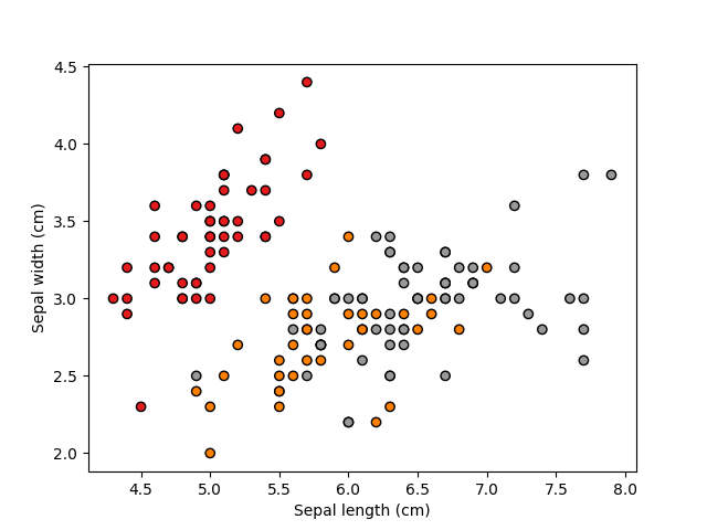
So, if you look carefully at the scatter plot, you may find that with only these two features, you can actually already separate one of the classes (in red, this is actually “setosa”) from the other two classes with a straight line (a linear classifier). So these kinds of observation will be useful to inform your machine learning design.
Now, let’s try visualising the remaining two features (petal width vs petal height)
plt.figure()
plt.scatter(x[:,2], x[:,3], c=y, cmap=plt.cm.Set1, edgecolor='k')
plt.xlabel(feature_names[2].capitalize())
plt.ylabel(feature_names[3].capitalize())
plt.show()
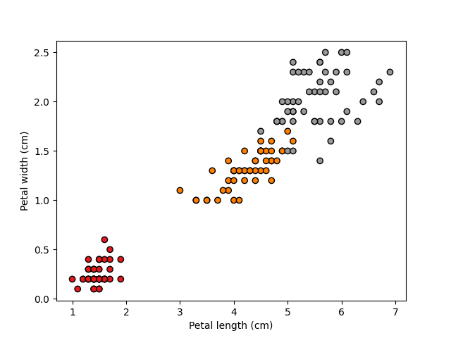
This looks even better! The first class (in red) forms its own tight cluster, while the other two are just about separable.
So such visualisation activities can actually be very useful for you to decide on what features to use!
If you want, you can try further combinations/views, for example sepal width and petal width.
Plotting histograms
While the statistics you computed earlier (min, max, median, etc.) might be useful, sometimes you can get more insights by visualising the value of the features itself.
So let’s say we want to check the values of petal width (since it seems like a good feature), separately for the three classes. We can plot a histogram of the petal width distribution for each of the classes.
fig, ax = plt.subplots(1,3)

ax[0].hist(x[y==0, 2], color='r')
ax[0].set(title=classes[0])

ax[1].hist(x[y==1, 2], color='b')
ax[1].set(title=classes[1])

ax[2].hist(x[y==2, 2], color ='g')
ax[2].set(title=classes[2])

plt.show()
plt.close()
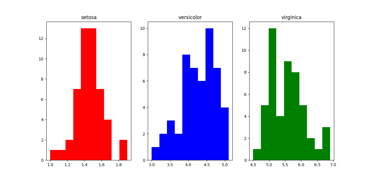
You can see that “setosa” can clearly be distinguished from the other two classes by petal width. For “versicolor” and “virginica”, there is a bit of an overlap when the petal width is between around 4.5-5.1. So there will be a bit of uncertainty here.
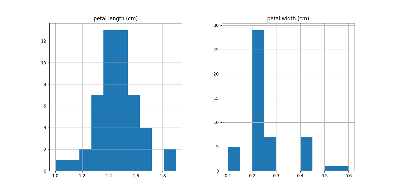
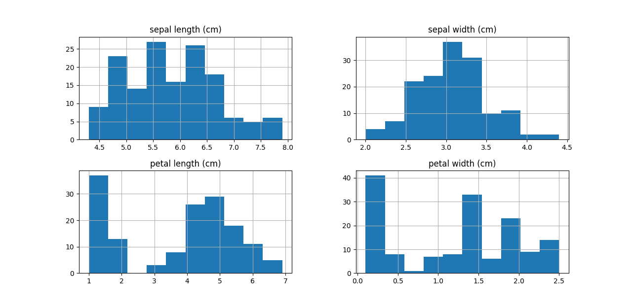
You can also use DataFrame’s .hist() method in Pandas to plot the histogram. You can actually plot histograms for multiple columns in one go.
import pandas as pd

df = pd.DataFrame(x)
df.columns = feature_names

fig = plt.figure(figsize=(8,8))
ax = fig.gca()
df.hist(ax=ax)

plt.show()
Of course, you can always select only a subset of columns/rows to visualise.
fig = plt.figure(figsize=(8,8))
ax = fig.gca()
df[y==0][feature_names[2:4]].hist(ax=ax)
plt.show()
