Introduction to Scikit-learn
Chapter 4: Understanding your features
Plotting histograms
While the statistics you computed earlier (min, max, median, etc.) might be useful, sometimes you can get more insights by visualising the value of the features itself.
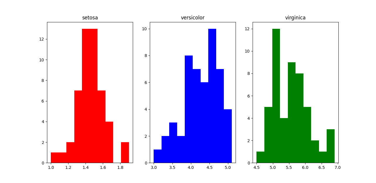
So let’s say we want to check the values of petal length (since it seems like a good feature), separately for the three classes. We can plot a histogram of the petal length distribution for each of the classes.
fig, ax = plt.subplots(1,3)

ax[0].hist(x[y==0, 2], color='r')
ax[0].set(title=classes[0])

ax[1].hist(x[y==1, 2], color='b')
ax[1].set(title=classes[1])

ax[2].hist(x[y==2, 2], color ='g')
ax[2].set(title=classes[2])

plt.show()
plt.close()

You can see that "setosa" can clearly be distinguished from the other two classes by petal length. For "versicolor" and "virginica", there is a bit of an overlap when the petal length is between around 4.5-5.1. So there will be a bit of uncertainty here.
Using pandas to generate histograms
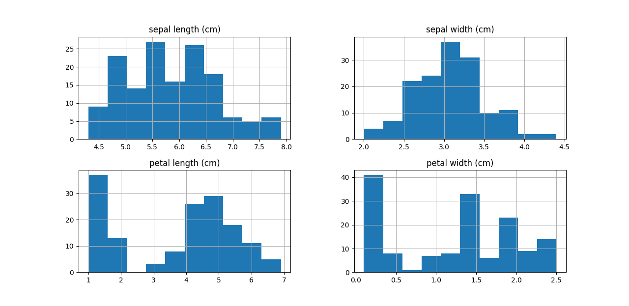
You can also use DataFrame’s .hist() method in Pandas to plot the histogram. You can actually plot histograms for multiple columns in one go.
import pandas as pd

df = pd.DataFrame(x)
df.columns = feature_names

fig = plt.figure(figsize=(8,8))
ax = fig.gca()
df.hist(ax=ax)

plt.show()

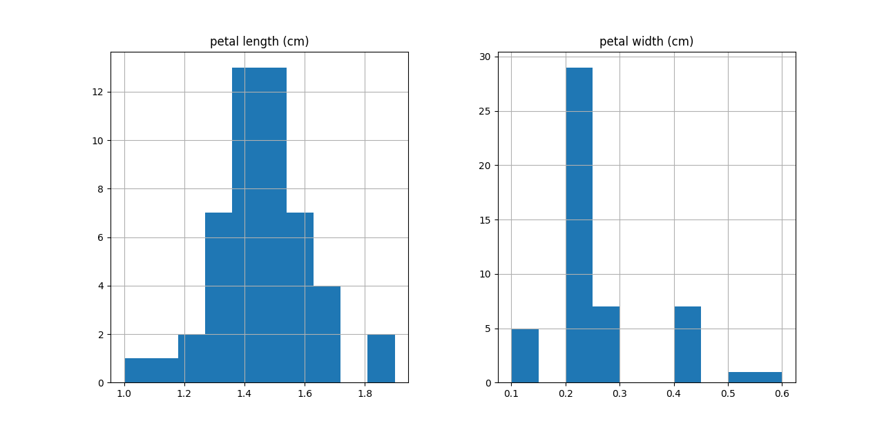
Of course, you can always select only a subset of columns/rows to visualise.
fig = plt.figure(figsize=(8,8))
ax = fig.gca()
df[y==0][feature_names[2:4]].hist(ax=ax)
plt.show()

