Introduction to Scikit-learn
Chapter 4: Understanding your features
Examining your features
Now that you understand your features, it’s time to really understand them by examining how they correlate with other features.
The most useful thing you can do is to visualise your features. This may give you better insights that you might have missed when looking at just the numbers.
Luckily, you are now experts at using Matplotlib and Pandas. So we will just make use of those tools!
Plotting a scatter plot for two features
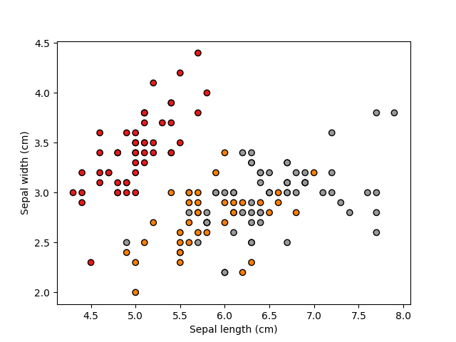
Let us first try to examine whether the features are actually any good for classifying the flowers. Let’s try to plot a scatter plot for the first two features (sepal length vs sepal width).
import matplotlib.pyplot as plt

x = dataset.data
y = dataset.target
classes = dataset.target_names
feature_names = dataset.feature_names

plt.figure()
plt.scatter(x[:,0], x[:,1], c=y, cmap=plt.cm.Set1, edgecolor='k')
plt.xlabel(feature_names[0].capitalize())
plt.ylabel(feature_names[1].capitalize())
plt.show()

If you look carefully at the scatter plot, you may find that with only these two features, you can actually already separate one of the classes (in red, this is actually “setosa”) from the other two classes with a straight line (a linear classifier). So these kinds of observation will be useful to inform your machine learning design.
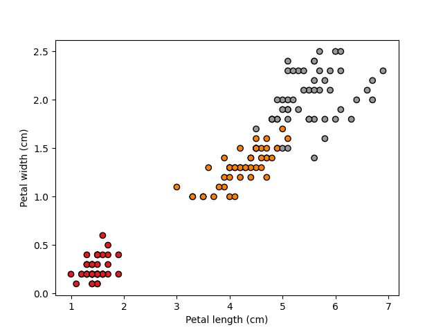
Now, let’s try visualising the remaining two features (petal width vs petal height)
plt.figure()
plt.scatter(x[:,2], x[:,3], c=y, cmap=plt.cm.Set1, edgecolor='k')
plt.xlabel(feature_names[2].capitalize())
plt.ylabel(feature_names[3].capitalize())
plt.show()

This looks even better! The first category (in red) forms its own tight cluster, while the other two are just about separable.
So such visualisation activities can actually be very useful for you to decide on what features to use!
If you want, you can try further combinations/views, for example sepal width and petal width.
